Improving the UX/UI for SaaS A Company
Jobma
Jobma
The Challenge
We were asked to serve as a creative services partner to rebrand, reposition and redesign Jobma, a SaaS company. Jobam wanted to disrupt the video interviewing market space by decreasing the cost per interview for afforability and making it simple to use.
The brand needed to resonate and connect with the client's target audience and needed a full refresh. After reviewing the front end and the back end of Jobma, it is clear that there is room for improving the user experience by redesigning the current website for an improved user journey, design, content and to increase higher conversion rates. The brand needed to be sticky and memorable.
The Discovery
Strategy (using the Trent Creative Amplify & Thrive Process):
- Audit and review the front end and backend of the website.
- Hold a structured Discovery Session to define the essence of the brand.
- Define distinct user groups, personas, journeys and needs.
- Create a revised sitemap based on UX/UI
- Create content strategy and copy editing
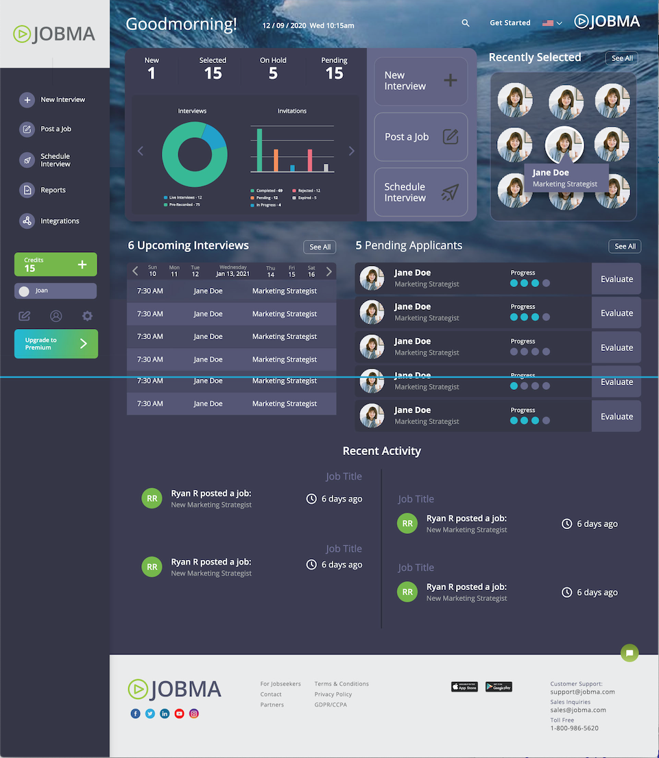
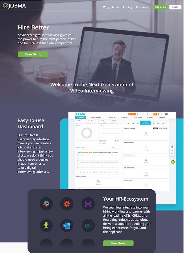
- Redesign frontend and client dashboard based on brand discovery and UX/UI

The Results
- Created consistent and corporate branded look and feel
- Improved user experience and communications to clients
- Improved key messaging
- Created an easy to navigate and elevated dashboard experience for clients

